
Use the Products block to load your desired Ecommerce products for visitors to purchase.
ADD PRODUCTS
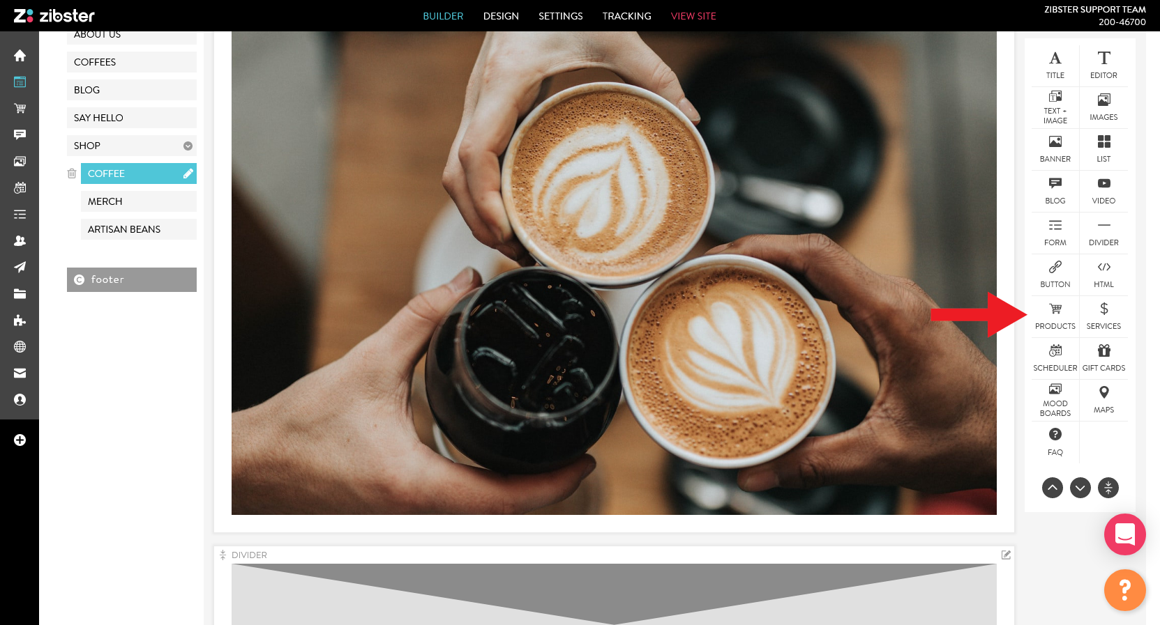
From your Block Editor on the right side of the screen, click on the products block to add it to your page.
EDIT PRODUCTS
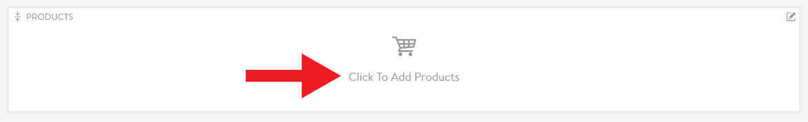
Once the products block has been added to your page, click inside of the block to customize it.
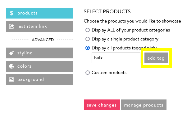
You can control the products you want to display. Choose to display all of your products, a single product category, products with specific tags, or custom products. If you need to make edits to any of your items, click the manage products button.
Display ALL of your product categories: Choose this option to display every product you have for sale.
Display a single product category: Choose this option to display all created products within one product category.
Display all products tagged with: Choose this option to display products with specific product tags. You can choose to display one or multiple product tags in this section. After typing your desired tag, click add tag to apply your selections.
Click here to learn more about product tagging.
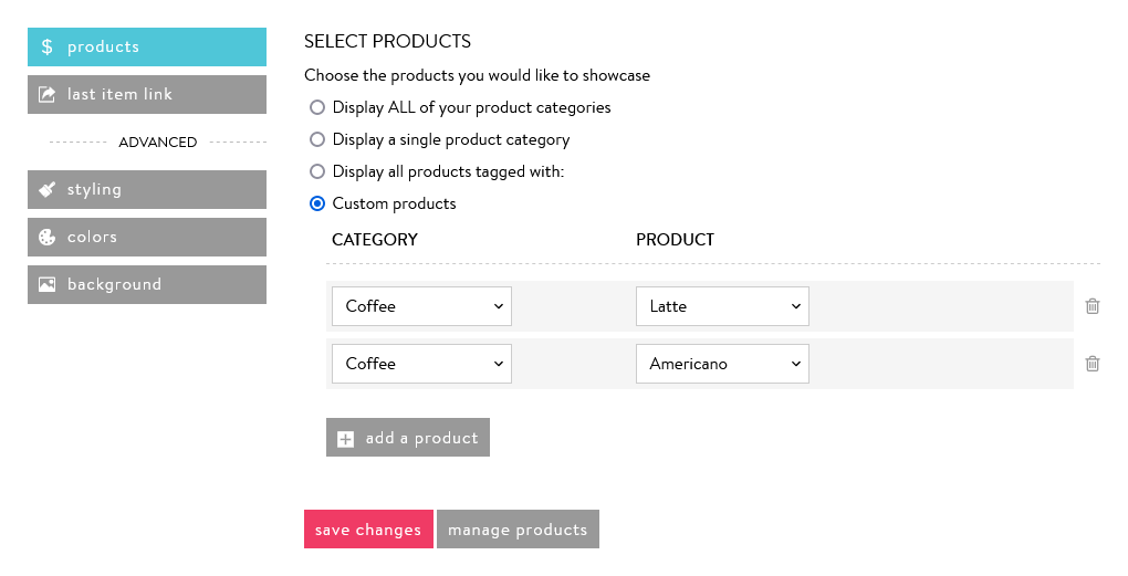
Custom products: Choose this option to select specific products to display in your current block. Click add a product to add more products.
When you have finished adding your products, click save changes.
CHOOSE A LAYOUT
The Layouts determine the display of your products' image, title, and price in addition to the number of products that show within the block.
Click change under current layout to make your selections.
Rows and Columns: The number of rows and columns you choose to display within the Product block determines how many of your products show. For example, if you have 30 products created in Ecommerce and choose to show two rows and three columns in your Products block, only six of your 30 products will show. The rows are horizontal and the columns are vertical.
Modern Layouts: Display the product title and price on top of the products' image.
Editorial Layouts: Your products' title and price display below the products' image.
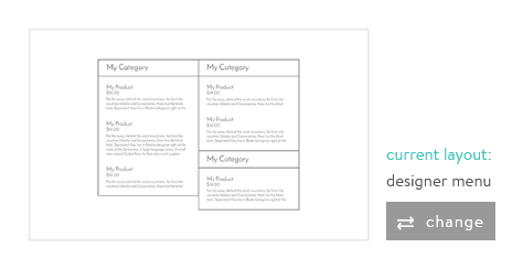
Designer Layouts: The product price shows on top of the products' image; the products' title shows below the image.
Gallery Layout: Display product images in a larger format, with the title and price listed beneath the image.
Menu Layout: Display products without images in the style of a restaurant menu.
Single Item Layouts: Display a single product with all of its corresponding information (title, description, price, and all images).
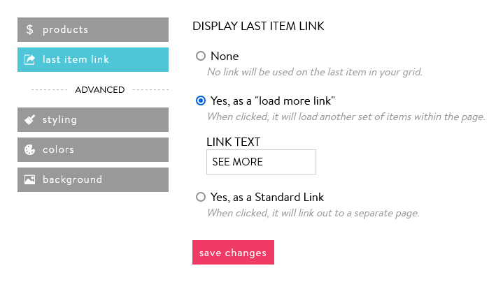
LAST ITEM LINK
Using the Last Item customization feature allows quick loading of your content, and for your users to choose to view more of your products. The Last Item feature does not apply if you are using the Gallery or any of the Menu or Single Item layouts. If you have more products than your selection of rows and columns in the Layout area allow, you have the following options for the last item in your sequence:
None: The exact number of products according to your selection of rows and columns will display.
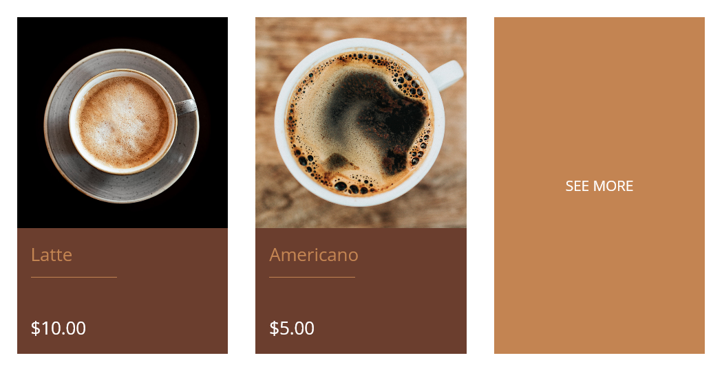
Yes, as a "load more link": A link will display as the last item in your sequence of products, which will load more of your products once clicked. You can customize the text that shows in this box in the LINK TEXT box provided.
For example, if you choose to display two rows and three columns of products, the last product on the second row will be replaced with your custom link text prompting users to click to load more products.
Yes, as a Standard Link: Similar to the previous load more option, this choice displays a box with custom link text as the last item in your sequence of products that connects to another area.
Link options include:
NONE: Your button would not link anywhere.
EXTERNAL LINK: Direct your clients to helpful resources that exist in a place other than your website.
PAGE: Direct your visitors to an existing web page on your website.
FORM: Connect to a Custom Form you have created in your FORM BUILDER.
MARKETING: Direct users to a Campaign or Landing Page you have created in the MARKETING tool.
FILE: Allow users to open a PDF, JPG, PNG, or GIF file that has been uploaded to the DOCUMENTS area of your account's FILES section.
PHONE: Connecting your button to a phone number allows users to quickly click to call you.
EMAIL: Connecting your button to an email address opens a user's default mail client to easily send you an email.
ADDRESS: Allow users to find where you are by opening an address in Google Maps.
VIDEO: Add a video embed code obtained from YouTube or Vimeo to play in a light-box.
ADVANCED SETTINGS
STYLING
The product styling section includes six styling options: Overlay Opacity, Space Between Items, Space Below Blocks, Space Inside Blocks, Flushing, and Mobile View. These styling sections will override the settings that have been picked in the global styling section under DESIGN tab.
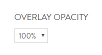
Overlay Opacity: Adjusts the opacity upon hovering over an image. This setting only applies to layouts where titles and prices are seen by hovering over an image. Increase or decrease the opacity of your overlay by adjusting the percentage.
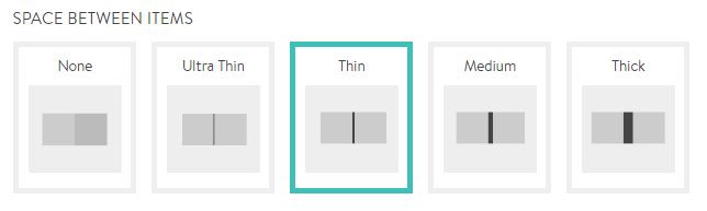
Space Between Items: Controls the spacing between images using grid layouts.
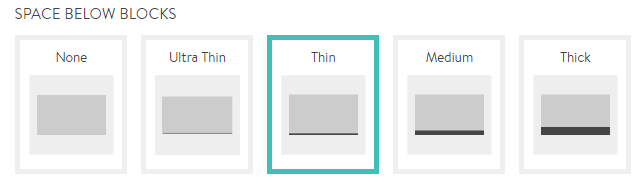
Space Below Blocks: Controls the amount of space before the next block begins.
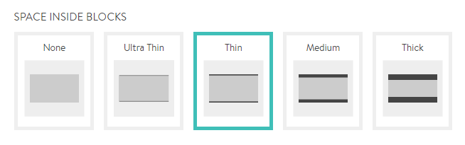
Space Inside Blocks: Controls the amount of space at the top and bottom of a block.
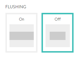
Flushing: Controls whether the content of this block flushes to fill the screen width or remains contained in the center.
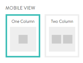
Mobile View: Controls if images on mobile and smaller devices display in one column or two.
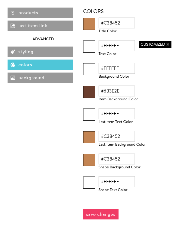
COLORS
The product color section includes several color options. These colors will override the colors for the buttons and background that have been picked in the global color section under the design tab.
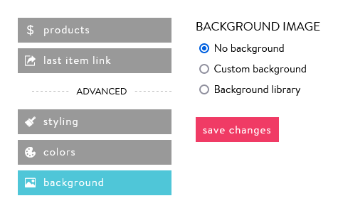
BACKGROUND
You can customize a background image behind your Product block to be different from your website background.
0 Comments